I’m 47, I’ve Watched Evangelion Too Many Times, and Now My Proxmox Cluster Has a MAGI Panel
I’d imagined this screen for thirty years. The idea was never the hard part — execution was, and that’s the bit I finally had help with.
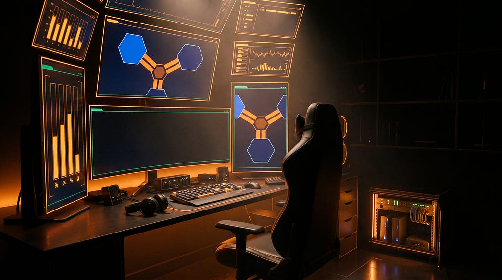
I have a rack in my study with a Raspberry Pi on top of it wired to a 1280×400 ultrawide bar LCD. For a while that screen did nothing, because the status of my homelab lived where it lives for everybody: in a browser tab I had to remember to open, which meant I opened it after something had already broken.
I have also watched Neon Genesis Evangelion more times than a man my age should admit to in public. It aired in 1995, when I was a teenager, and the thing that stuck wasn’t the giant robots. It was the MAGI: three supercomputers — Melchior, Balthasar and Casper — built by one scientist who split her own personality across them so that they would argue. They deliberate. They vote. They deadlock, and when they do the screen says so in enormous orange letters and everyone in the room has to deal with it.
Thirty years later I had three machines about to become a three-node Proxmox cluster with quorum. Three computers that vote, can disagree, and need a majority before anything is allowed to happen.
That isn’t a metaphor. That is what quorum is.
So I did the obvious ridiculous thing: named the cluster magi, named the nodes after the three, and built them a status panel that looks like the one in the show. Then it got interesting, because an anime obsession is about aesthetics and a monitoring panel is about truth, and those two things fight — constantly, and over things I’d never have predicted. Every collision resolved in favour of truth, usually because the agent I was building it with went and measured something I’d have been happy to eyeball.
I’ve written about this homelab before: turning Home Assistant into a Grafana data platform, building the dashboard I’d abandoned three times, and the alert that made the whole thing pay for itself. Same collaborator, same principle: I supply direction, the agent supplies execution.
The setup
Two panels, one collector, polling the Proxmox API with a read-only, privilege-separated token.
- The rack bar — 1280×400, amber on black, three unit columns, live CPU traces. It runs on the Pi, named ibuki after Maya Ibuki, the bridge operator whose job is to read the MAGI’s status out loud. The name is doing work: that box observes the cluster through a token that can read status and nothing else. It reads out loud; it has no authority.
- The desk console — 1080×1920, portrait, fullscreen, under a wall of security cameras. A much closer reading of the show’s visual language, and it absorbed the Uptime Kuma board that used to have its own window.
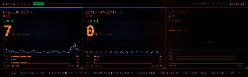
One structural decision shaped everything downstream: both panels run their own collector and their own web server, locally. A panel whose job is to tell you the cluster is unhealthy must not be served by the cluster. Hosted on the node, a node outage blanks the screen that would have told you about it. Hosted locally, that same outage renders as MELCHIOR 停止 in red on a panel that is still up.
Lesson: The thing that reports a failure must not depend on the thing that can fail.
The whole cost is about 1.4 small authenticated JSON GETs per second across the lab, against a node running 37 guests. Both panels, the collector and the systemd units are on GitHub: github.com/angusmaul/magi-display.
The panel that can look perfect and know nothing
The architecture is simple. A collector polls the Proxmox API every five seconds and writes data.json to disk. A local web server serves that directory. The page fetches data.json every five seconds and re-renders. And the clock in the header ticks in the browser, once a second, on a setInterval that knows nothing about any of the above.
So what does the screen look like if the collector dies?
Perfect. The web server is still up, so the fetch still succeeds. The last data.json is still on disk, so the response is HTTP 200 with valid JSON in it. Every node reads online, every gauge holds its last value, and the seconds keep counting.
A frozen panel and a healthy panel are, visually, the same panel.
Failing to a red LINK LOST when the fetch throws catches nothing here, because nothing throws. The request is fine. The JSON is fine. The data is three hours old. So the collector stamps every payload with the time it was written, and the page checks that stamp before it believes a single number:
if(d.updated && (Date.now()/1000 - d.updated) > STALE_AFTER) d.link = false;STALE_AFTER is 30 seconds — six poll intervals, so one missed tick never trips it.
Lesson: “The request succeeded” is not the same claim as “this data is current.” If a payload can’t tell you when it was written, you can’t distinguish a live system from a corpse — and every animated thing on the page will vote for live*.*
The two red states are deliberately different. EMERGENCY asserts the cluster is broken; LINK LOST asserts only that we can’t see it. Under LINK LOST the units render 不明 (unknown) rather than 停止 (stopped), because a dead collector is no evidence about any node. At 2am that’s the difference between driving to the rack and going back to bed.
Every field is real
The reference frames are dense with gorgeous nonsense. CODE : 666. EXTENTION : 0256 — misspelled, in the original, in a show that ran on national television. PRIORITY : S+. It’s fantastic, and it’s a lie generator: a display covered in numbers that mean nothing trains you to stop reading the numbers that do.
So the rule is nothing on screen is set dressing. The only non-data text is the frame words CURRENT and OPERATIONS, and the unit names. Everything else is a live reading:
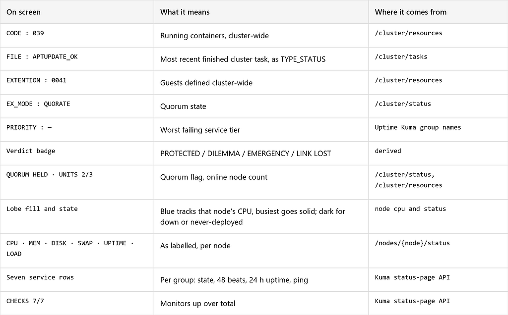
The misspelled EXTENTION is the reference’s own error and it stays — it’s the most recognisable detail on the screen and the number under it is honest. One field didn’t survive: TIME REMAINING TO COLLAPSE, the best thing in the alert frame, which has nothing to count down to. The fourth corner carries TIME SINCE RAISED instead, a real elapsed timer on a real fault.
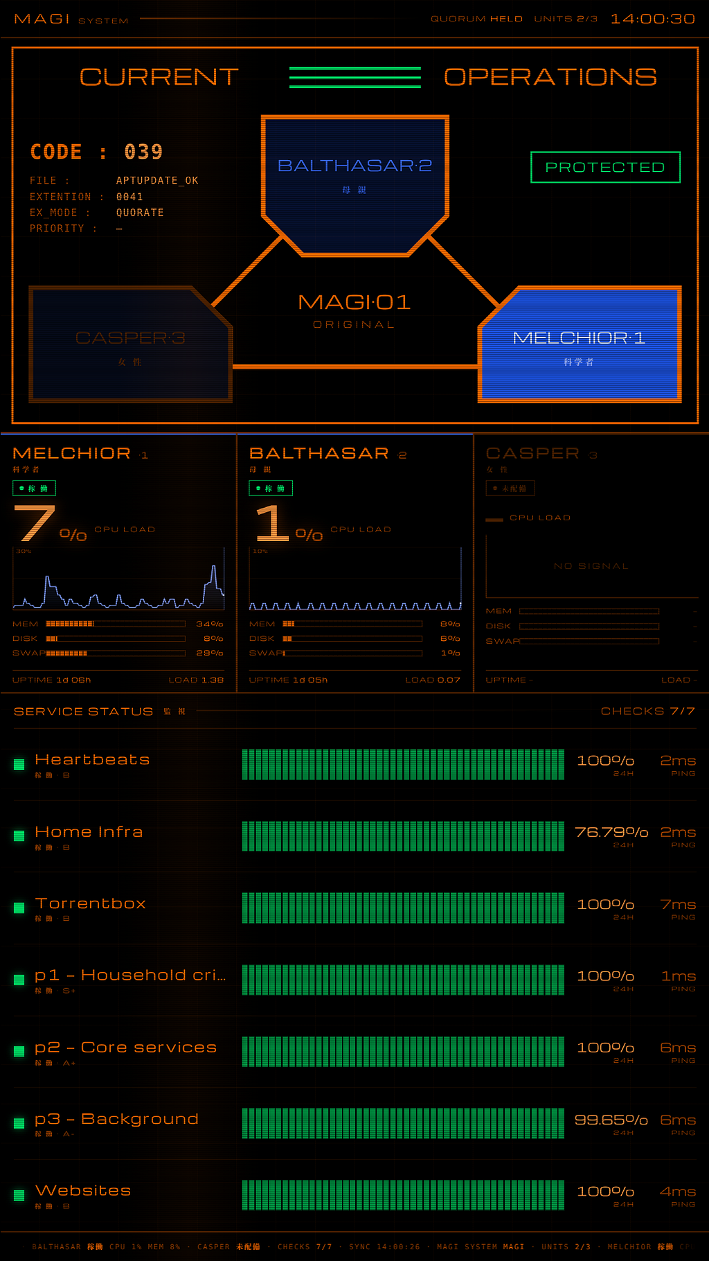
The rule ran back through the rack panel too. An earlier layout had CODE in the data block showing failing checks and a second CODE: in the footer showing something else — two fields, same name, different values, one screen. The rack panel’s footer had also carried a hardcoded CODE:601 since day one. Both gone.
Lesson: Decorative data isn’t neutral. It teaches the reader that the numbers on this screen are vibes, and that lesson generalises to the numbers that matter.
The permanent emergency I nearly shipped
Every five seconds the panel picks one of four verdicts, and that rule is fixed in code:
const crit = lost || !d.quorate || d.priority === "S+";Quorum is tested first, before anything is painted, because the colours everything else is drawn in depend on the outcome. Losing quorum can therefore never render as PROTECTED or even as amber DILEMMA — not even when every other signal is healthy. All five states were checked against synthetic payloads, including “quorum lost and nothing else wrong at all.”
A missing quorate field is falsy, and therefore also critical — unknown quorum fails safe rather than nominal. That choice nearly shipped a disaster of its own: a collector that doesn’t emit the field puts the console into a permanent EMERGENCY the moment it sees real data, which is exactly what the collector did. The quorum call was gated behind an environment variable the console hadn’t been given. Caught before first deploy, by testing the collector’s actual output rather than assuming it agreed with the panel about the payload shape.
Same trap in the service list: if Kuma is unreachable the collector emits an explicit null, not an empty array, because services: [] renders as seven silent green rows — seven services, all fine, none of them checked.
When you can’t distinguish “fine” from “unknown”, make the code land on unknown.
Drama versus diagnosis
The show’s alert frame is a full-screen red takeover: radar rings, rotating wireframe, an enormous centre word. Best-looking thing in the reference, and nearly useless, because it shows four fields. At the moment things are worst you lose the schematic, the vitals and the per-unit detail. Nobody sees the drama at 03:00; the person who walks up at 08:00 needs to know what broke.
So it’s split. The critical palette lasts the whole episode; the full-screen takeover runs 30 seconds and then retires to the normal diagnostic panel, still in red.
It re-fires on a change in the kind of fault, never on the failing-check count. Key it on the count and a number flickering 11 → 12 → 11 restarts the window every poll and the takeover never retires — it just sits there forever, four fields deep, being dramatic. A retry loop with better art direction.
One consequence I didn’t see coming: because the panel now stays in red, anything drawn with a hardcoded colour ends up blue on a red display. Canvas can’t read a CSS variable, so every colour the JavaScript writes had to be declared as a variable and read back once per render. This shipped wrong for half a day — the panel went correctly red and left three cheerful blue CPU traces on top of it.
Reading the source properly
The trilobe schematic — Balthasar as a pentagon at the top, Casper and Melchior as slabs below, joined into a Y by thick orange bands — isn’t eyeballed from memory. Four frames of the reference were read directly and the geometry traced off them.
What came out of that: the connecting bands branch from the exact midpoint of each chamfered corner, and the chamfer carries on past the branch. Balthasar’s chamfer midpoints sit at (527,400) and (751,400); the bands leave at (525,397) and (753,397). Two and three pixels off the midpoint — which is to say, the midpoint.
An earlier version joined the shapes corner to corner, which is what you’d do from memory. It’s wrong in a way that’s hard to name until you see them side by side: the junctions read as folds rather than as a branching bus.
I would have shipped that version, looked at it, thought “yeah, that’s the MAGI”, and moved on. It’s right because the agent went back to the actual frames and measured — the same discipline that read the 404 instead of assuming the token was fine on the dashboard build. Just pointed at a cartoon instead of an API.
The typography rabbit hole
Evangelion’s real faces aren’t a guess: Matisse EB for the NERV interfaces, Eurostile for signage and UI. Matisse is the recognisable one — an ultra-bold Mincho, thin horizontals, thick verticals, triangular feet, chosen by Anno against the era’s fashion for sans. Both are commercial, so: stand-ins.
The Japanese one resolved itself embarrassingly easily. A heavy Mincho was already installed — Noto Serif CJK JP Black, sitting in a font package, zero downloads. Found by looking at what the machine already had rather than by shopping.
The Latin one is the story. A “free Eurostile” from a font-download site turned out to be a 1991 Digital Typeface Corporation clone, distributed under a name Monotype holds the trademark to, with no licence fields in the file at all. Not ambiguous — empty. Rejected, and Michroma went in instead: OFL, 64 KB, close enough in spirit.
That cost a full round of resizing, because Michroma runs ~35% wider than the fallback and has exactly one weight — a synthetic bold on a face that wide smears the verticals. CURRENT / OPERATIONS went from 44px bold to 34px regular, the unit labels 30 to 23, the verdict badge 26 to 19, each checked against a screenshot of the real screen rather than a browser preview.
Eurostile is still named first in every font stack, so a licensed copy would take over with no code change.
Names that do work
Both panels are keyed on the Proxmox node name. A unit with no matching node renders dark and greyed, reading 未配備 — “not deployed”. So casper, currently a Windows box that hasn’t joined anything, sits on both screens as a dark third lobe. The day it joins the cluster it lights up by itself. No code change, no redeploy.
And the desk console is the funny one: that machine is also the cluster’s QDevice, the external tiebreaker vote that lets a two-node cluster survive losing a node. So the console renders a quorum state that it is itself one third of. A dark panel is also a lost vote. That’s not a bug — the box that shows you quorum is the box whose absence changes it — but you want to know it before you read the header.
The header says QUORUM HELD, not 2/3, because /cluster/status returns quorate as a bare flag with no vote counts and no mention of the QDevice. The counts exist in pvecm status, which is a shell command, and reaching it would mean giving a wall display SSH into the cluster. The panel says exactly what the API can support.
Smaller traps, for the record
- The page must be served over http, not file://. A file:// origin is opaque, so fetch(“data.json”) is blocked as cross-origin and silently never returns — and there’s no console anybody is reading on a wall display.
- Copying the page to the host changes nothing on screen. The poll fetches data.json, not the HTML, so the browser keeps rendering the markup it loaded at session start. A page change needs the browser restarted. An earlier version of my own README confidently stated the opposite.
- A hostname rename left a stale browser profile lock symlinked to the literal old hostname. Chromium compared it to the current one, decided another machine held the profile, and refused to start — but only on a manual relaunch, so it read as a broken command rather than a stale lock.
- Screenshotting the console is its own saga. X11, so grim doesn’t apply; xwd -root fails with BadColor on that visual, so you capture by window id; no PIL on the box so you decode locally; and the XWD header’s bytes_per_line is field 12, not 14 — an off-by-two gives “not enough image data” and no hint why.
- Pixel-scanning a screenshot to check alignment works, but bound the scan. One unbounded scan caught the SVG frame’s right edge and reported OPERATIONS as overflowing when it had 60px of clearance. A font size got cut for nothing.
What it looks like now
- Two live panels on separate hardware, each with its own collector, web server and separate read-only token — so rotating one can’t silently blank the other.
- One collector, not a fork. Console-only extras are gated behind an environment variable, so the rack Pi costs the cluster exactly what it always did.
- Every field sourced. Two frame words and three unit names are the only text on either screen that isn’t live data.
- Four verdict states, verified against synthetic payloads, previewable with keys 1–4 without inducing a real outage.
- A dark third lobe waiting for a node that doesn’t exist yet.
The honest part
Every time I write one of these up I end on what actually unblocked it, and it’s never what I expect. With the dashboard it was that the tedious middle could be delegated. With the energy alert it was that the two projects before it already existed. This one lands somewhere else.
The aesthetic constraint did the engineering work.
I did not set out to build an honest monitoring panel. I set out to build a screen that looks like the MAGI. And because I was copying a fictional interface field by field, I had to ask of every element, “what is this actually saying?” — a question I have never once asked of a Grafana panel, where the fields arrive pre-justified. The tool emitted it, so it must mean something, so onto the screen it goes. Nothing forces the audit. A reference frame that is fiction forces it on every single field.
The clock is the sharpest version of it. It’s the most convincing thing on either screen — it moves, it’s precise, it’s the first thing your eye confirms — and it’s the only element guaranteed to keep working no matter how comprehensively everything behind it has failed. It costs one line of JavaScript and it’s worth nothing. A status screen borrows its credibility, by default, from the one component that knows nothing at all.
The agent’s contribution wasn’t the code, and it certainly wasn’t the idea. It was a willingness to do the part that has always sat between the two: tracing chamfer midpoints off video frames, reading licence fields inside a font file, testing five verdict states against synthetic payloads, checking what the collector actually emits rather than what it ought to. None of that is creative work. All of it is the reason most good ideas stay ideas.
And it did something I hadn’t expected delegation to do — it made the idea better. Left to myself I’d have shipped corner-to-corner geometry, a faked countdown and a font clone with no licence: a screen that looked about right and was wrong in three separate ways I’d never have noticed. What exists is more faithful to the thing I’d been picturing for thirty years than the version I would have built, because it went and checked what I was actually picturing.
The teenager who watched this show in 1995 would be delighted by the screen and wouldn’t have asked a single question about where the numbers came from. The 47-year-old needed it to be true, because there’s a real cluster behind it running things my family uses, and a beautiful screen that quietly stops knowing anything is worse than no screen at all. Both of them got what they wanted, which isn’t how these things usually go.
So: have the stupid idea. Then make it prove every number on it. The distance between imagining a thing and running it on your wall is the shortest it has ever been — and the idea was never the part you were short of.